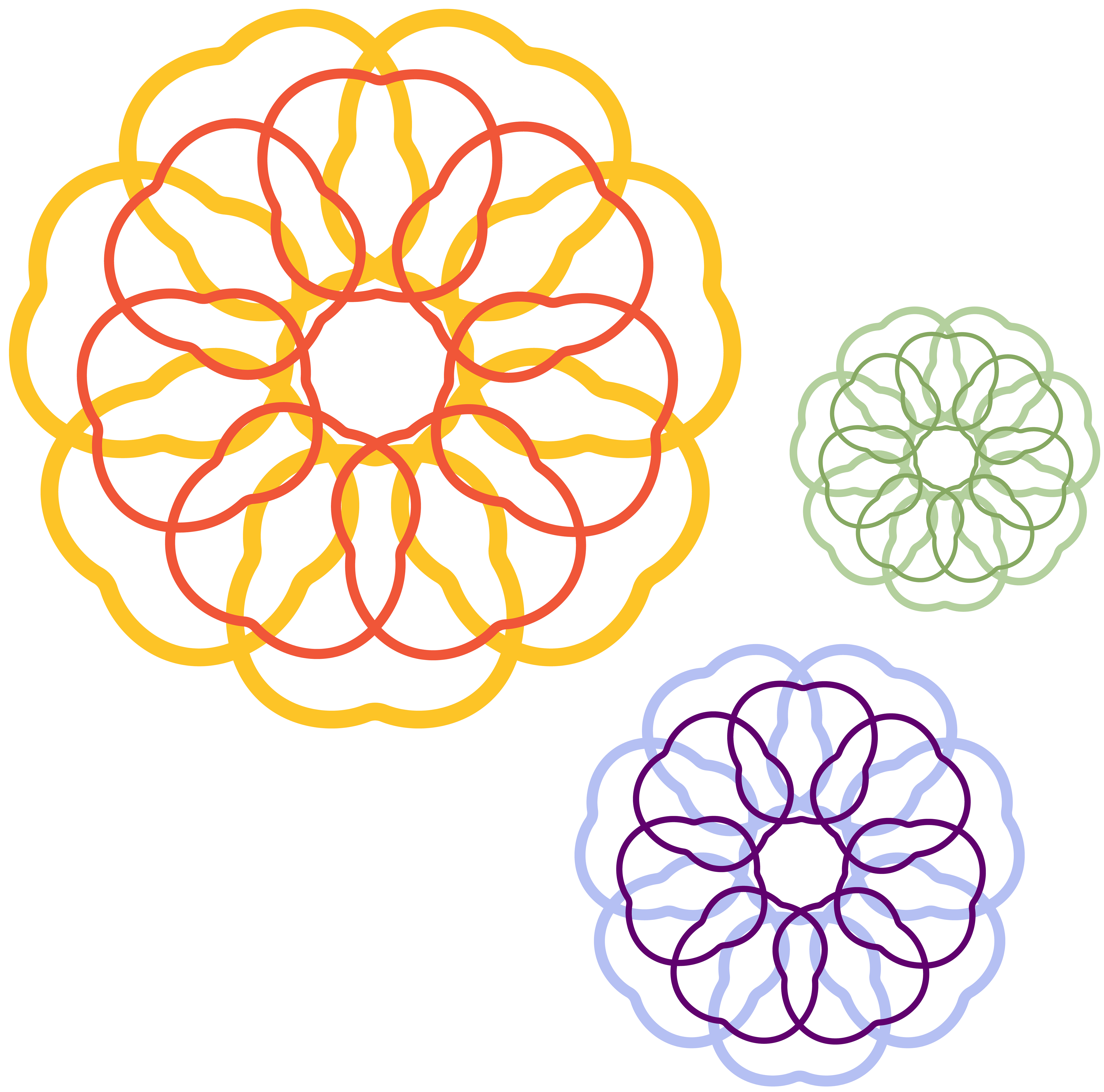
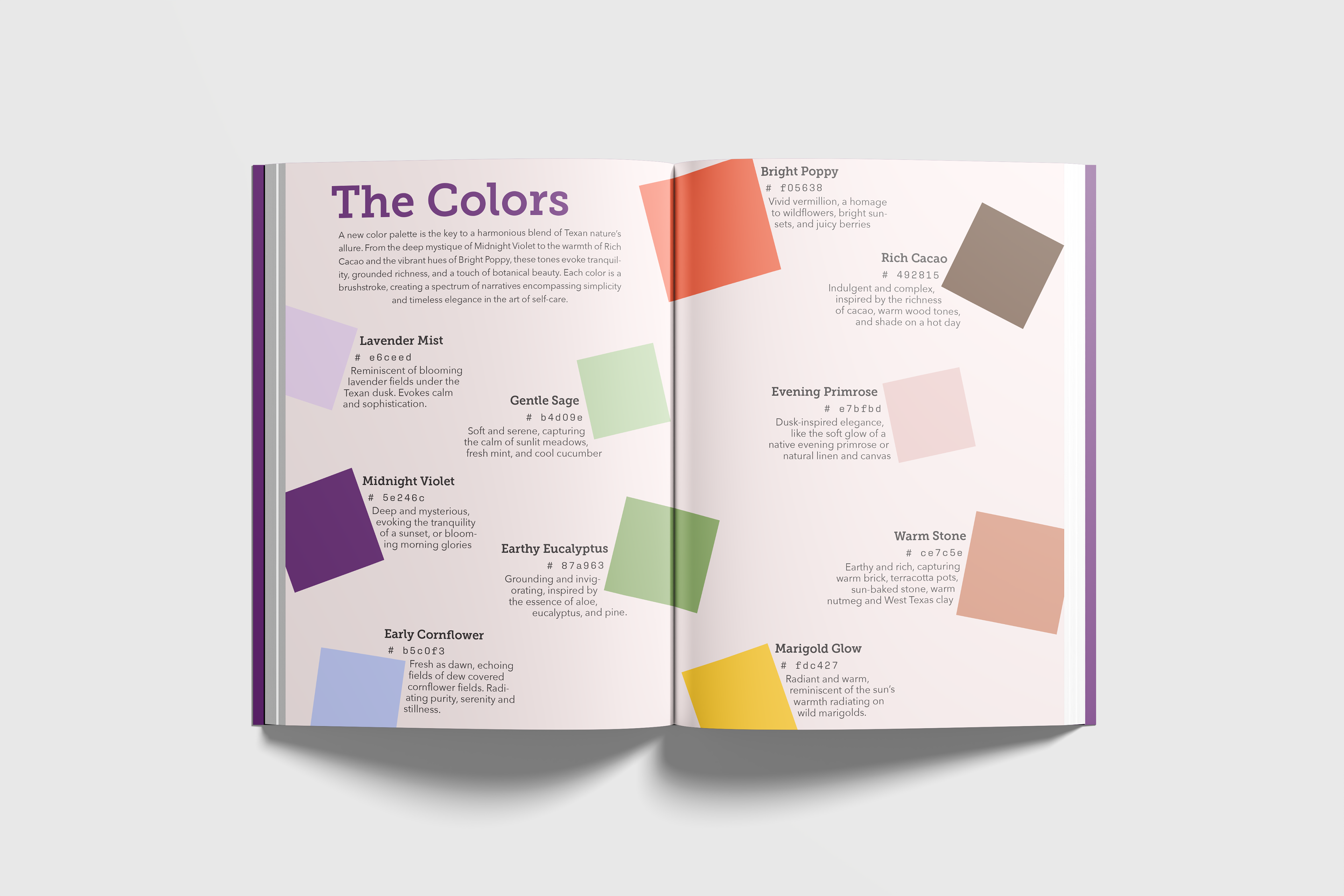
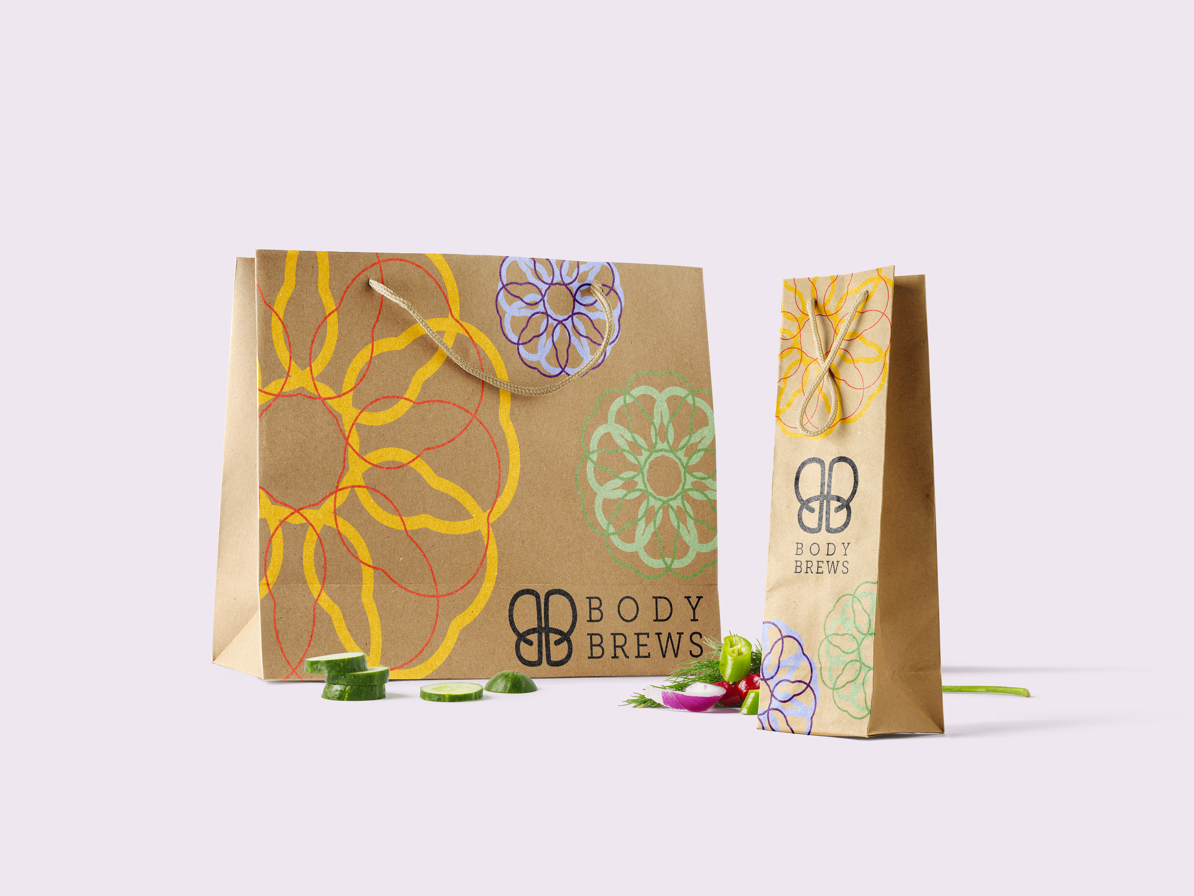
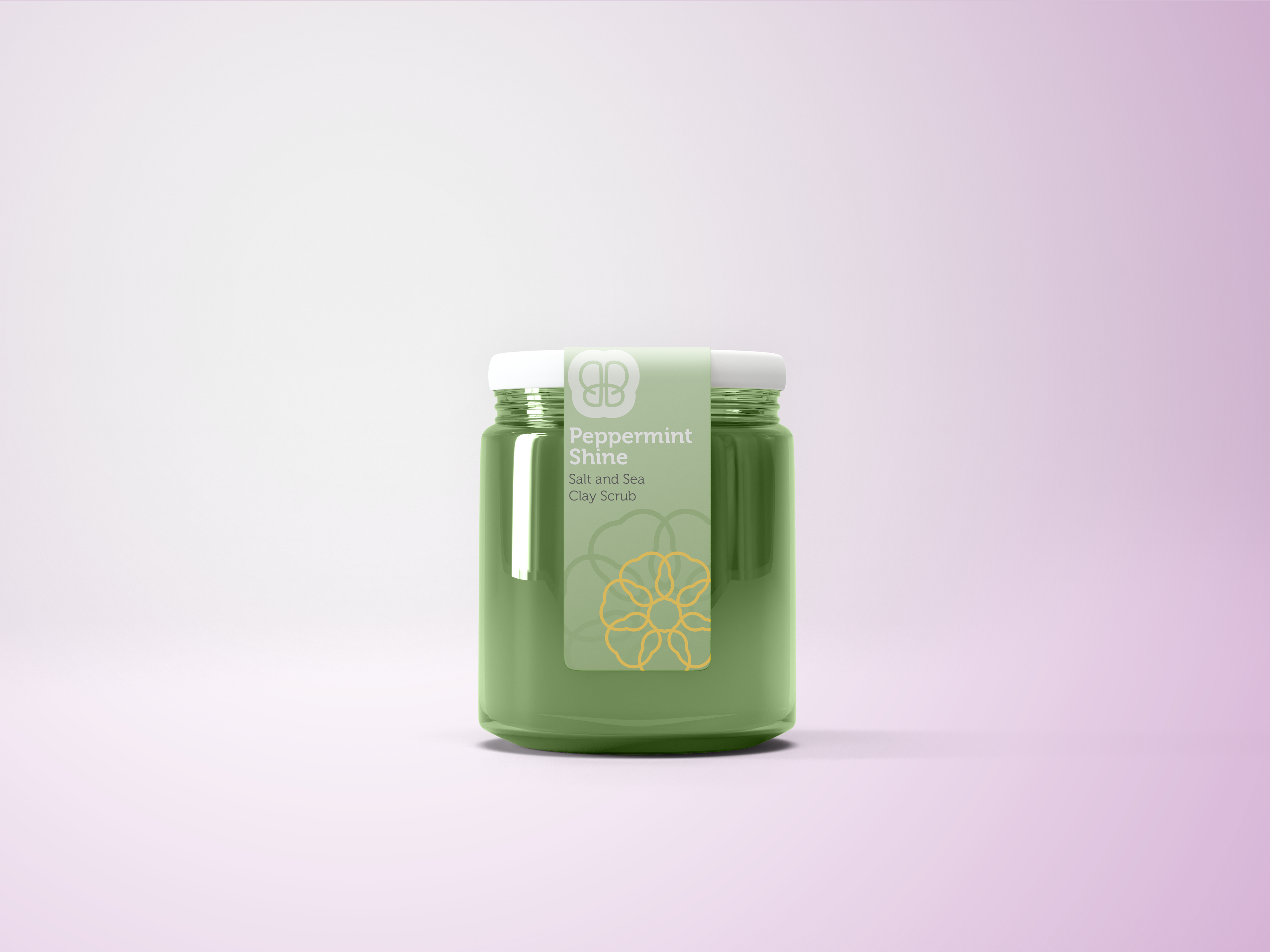
Above you'll find snippets of a brand asset booklet that went along with the gift. Note the wide-ranging color palette with a nod to the earthly ingredients found in the products and three neutral tones celebrating a diverse range of skin tones. A heavily-padded outline of the Double B (a conspicuous clover shape) also serves as an outline creating a clever illustration of a flower as pictured on the retail bags below.
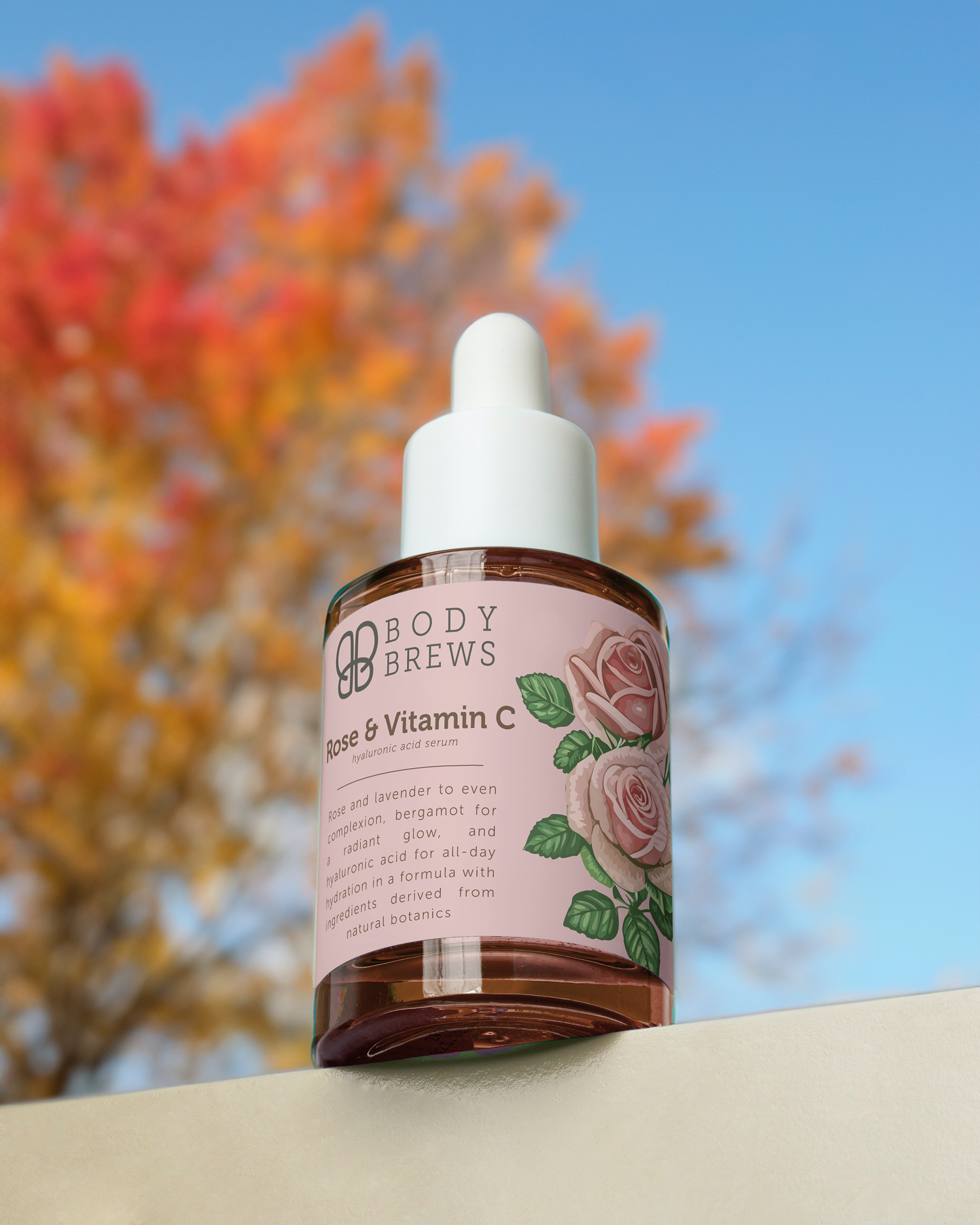
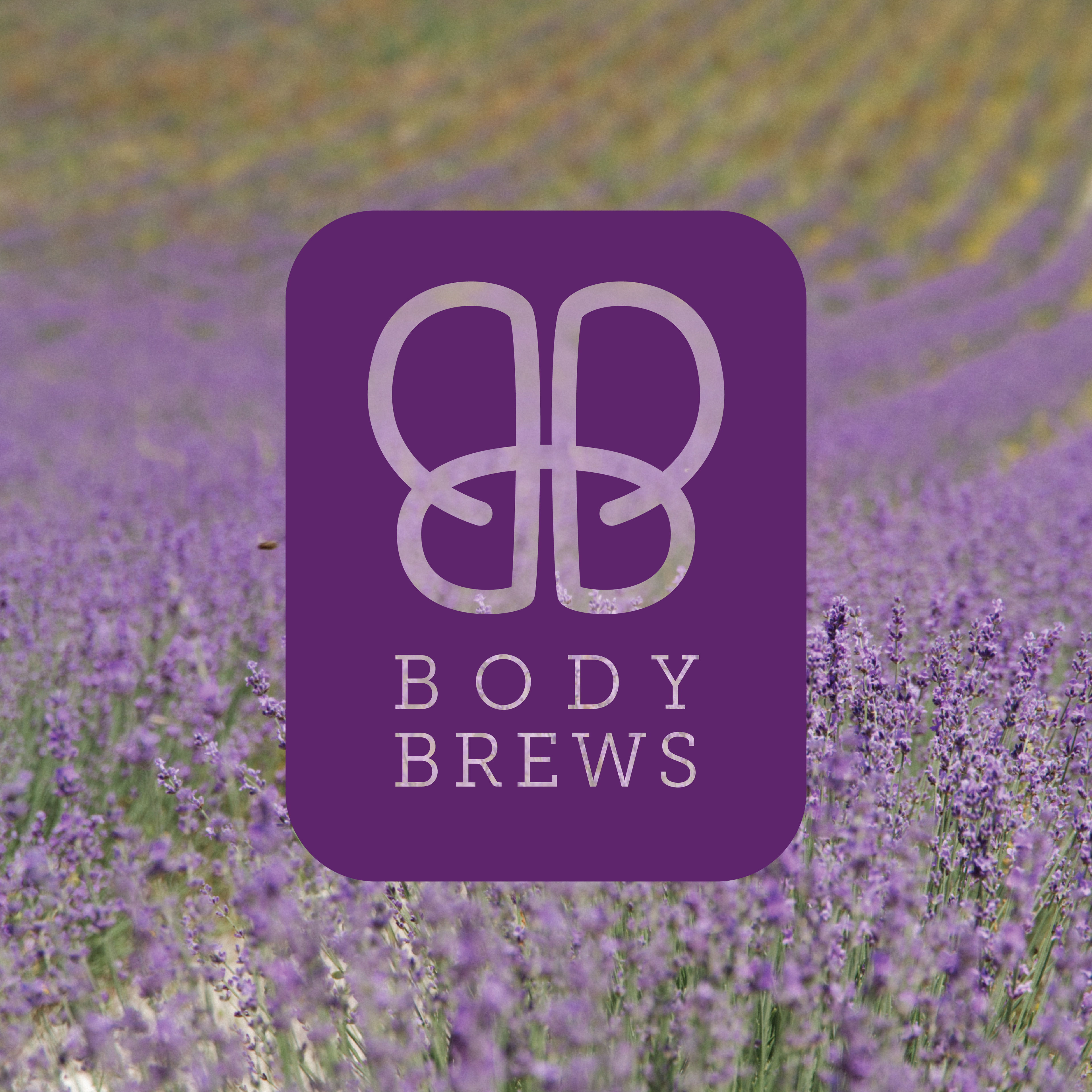
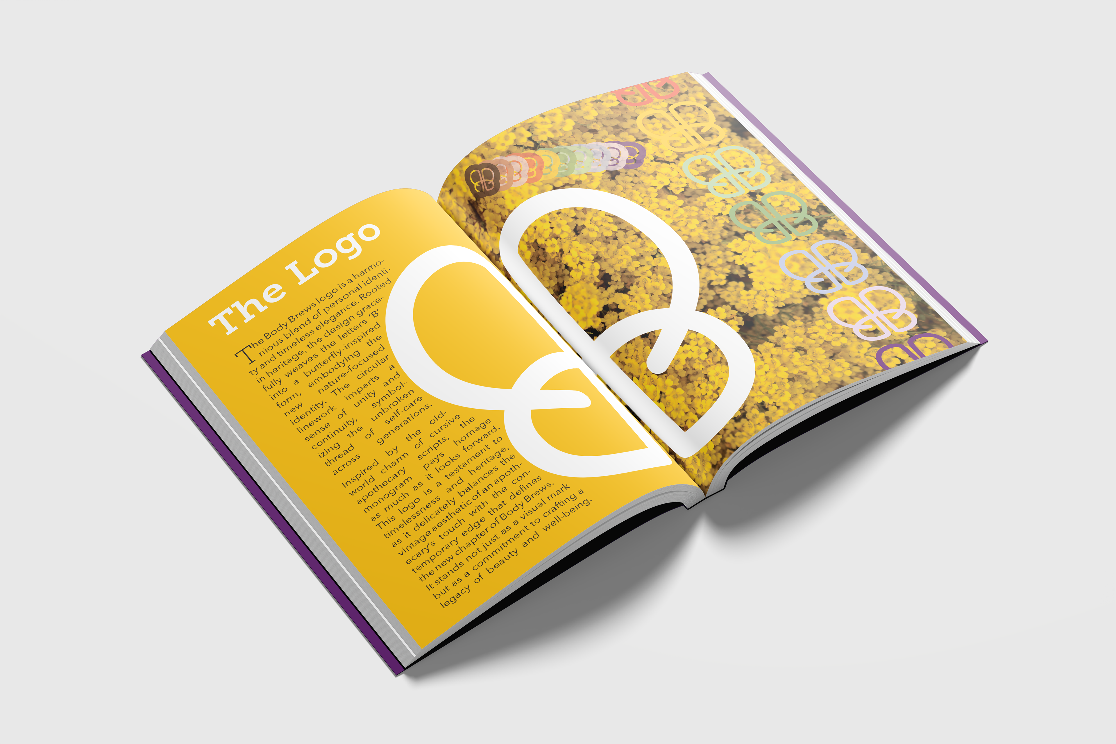
Again taking inspiration from old-fashioned and natural forms, you'll find another interpretation of the Double B. Inlaid inside of a the same rounded clover shape of the flower motif makes the 'Stamp' logo. Simple and with no word mark, this gives room for the simplicity of the content and the unapologetic, full-bleed expression of color. The key to the Body Brews look is fun, modern, and botanical without the pharmaceutical-grade-cleanliness of other modern cosmetics brands.
Logo, flower motif, typeset, and other artwork created in Adobe Illustrator
Book layout designed in Adobe InDesign
Mockups created in Adobe Photoshop
Stock imagery used in hero image and mockup designs
⬇️ The cloverleaf-turned-flower assets as extracted from the retail bag design